Our Client
Brotherton & Co are a established firm of Chartered Management Accountants providing accounting services, business and tax advice to companies and individuals in the West Midlands.
Objectives
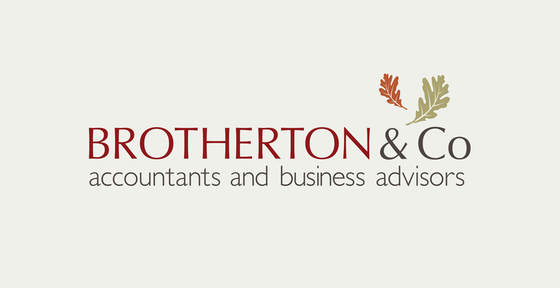
The company had an established branding but needed refinement to give greater flexibility across multiple platforms. The ‘& Co’ sub line in the original logo was used at a very small scale and its positioning gave the impression of an after thought to the main ident. The position and scale of the accompanying oak leaf motifs also caused issues for height restricted and small scale applications.
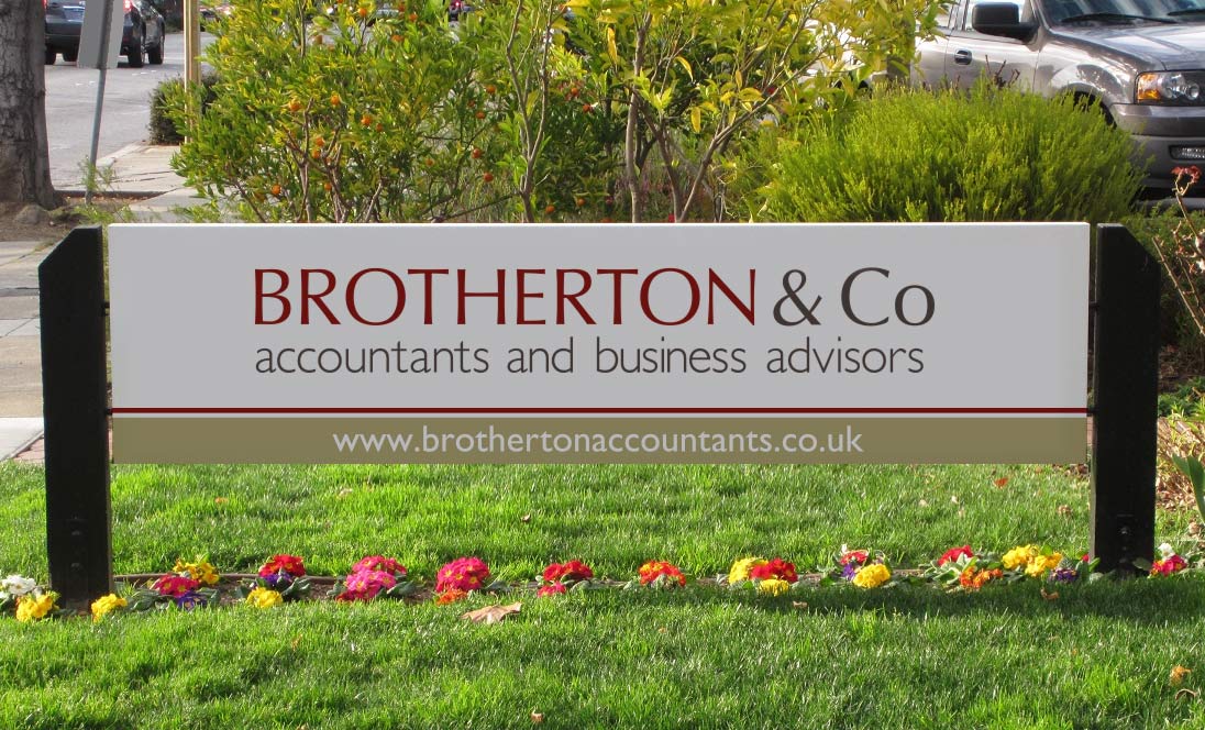
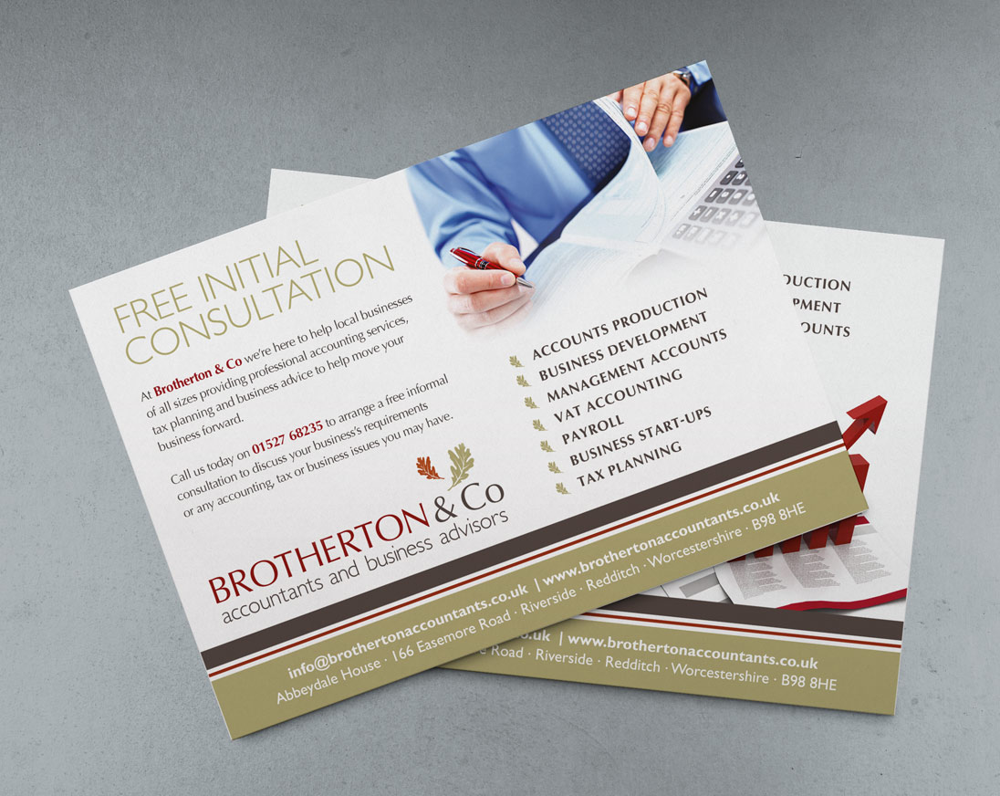
An updated suite of printed marketing materials and company signage was also required to reflect the new tweaked branding.
Our Response
Whilst keeping the motif and colour palette of the original company logo we re-sized and repositioned its core elements to give the logotype greater balance and flexibility. The two main typefaces of the original logo were reversed to utilise the more solid letterforms and authoritative feel of Optima in uppercase for the company name, and the open rounded letterforms of Gill Sans for the support line.
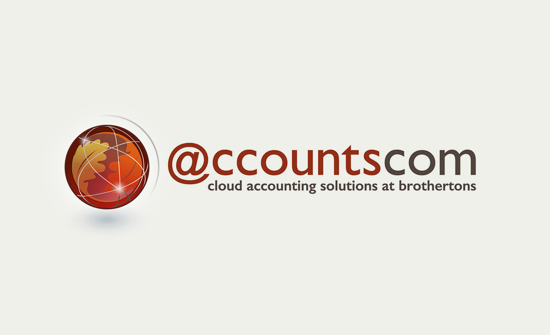
Supporting marketing materials including trade advertisements, leaflets and signage were produced after a review and update of the company image library and core colour palette. In preparation for Make Tax Digital changes for company accounting we also developed a separate brand identity for their cloud accounting platform accountscom, maintaining a clear link to the parent branding but with a technological focus.


