25 Jun Brotherton Branding Re-vamp
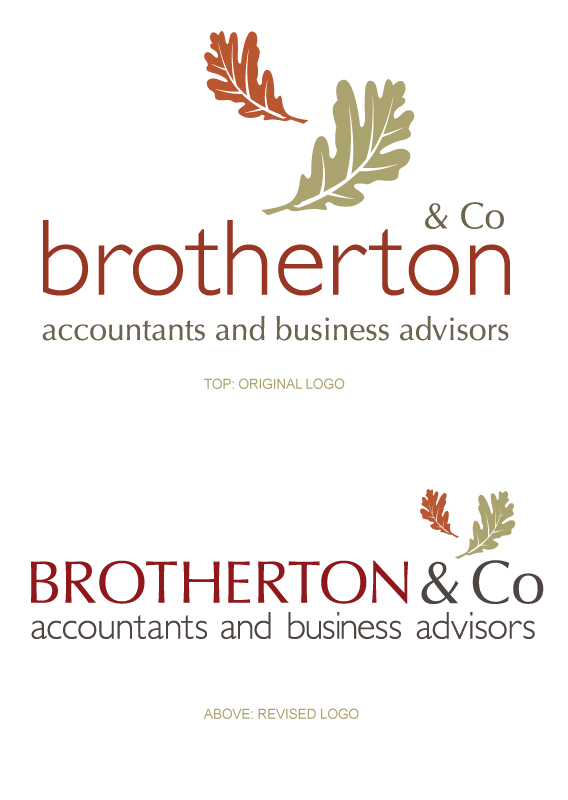
Just a small update with some recent rebranding work. Our very fine accountants here at ITW, Brotherton & Co. asked us to take a look at their branding and refresh some elements. After some detailed discussions and experiments with alternate concepts we decided that although many of the core elements of the branding were working well for the company, they could do with some tweaking. Whilst wishing to retain the company colour palette and oak leaf motif several steps were taken to give greater balance and flexibility to the logotype.
The original logo had a large leaf motif centred above the company name which caused issues for height restricted applications, and threw the header of the website off balance. By reducing and repositioning the leaves the new logo has greater flexibility in page positioning.
The size and positioning of the ‘& Co’ in the original logo made it seem almost an afterthought or as if the other partners were not quite as important. This was tackled by bringing it in line and the same size as the lead company name, so the two have come together in joint prominence.
Finally the house typefaces of a Gill Sans header & Optima sub line were switched to make greater use of the more solid form and classic lines of Uppercase Optima, and the light open qualities of Gill Sans for the smaller sub line.
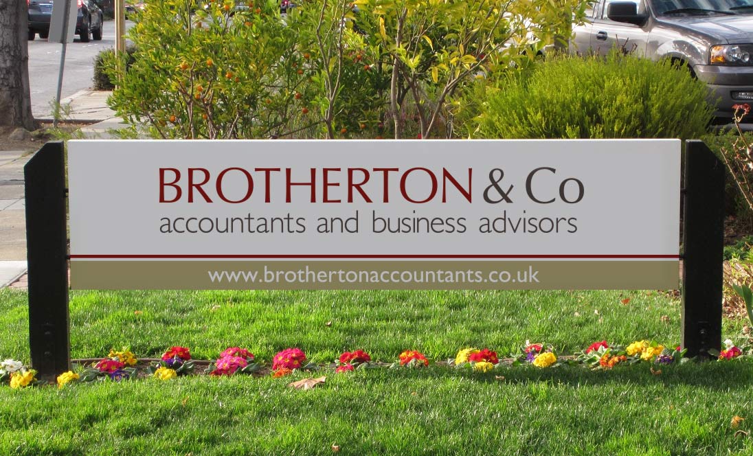
Whilst some tweaks to the company website have also been made work is also underway for a reworking of the company literature.
PS. If anyone is looking for a good accounts / business advisors I’d highly recommend giving them a call.